Happy to be India’s International Bank
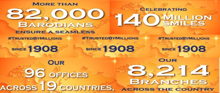
Proud to serve over:
-
183 million customers
-
 Across 15 countries
-
 Since
Since
1908
About Us
A saga of vision and enterprise
It is a story scripted in corporate wisdom and social pride. It is a story crafted in private capital, princely patronage and state ownership. It is a story of ordinary bankers and their extraordinary contribution in the ascent of Bank of Baroda to the formidable heights of corporate glory. It is a story that needs to be shared with all those millions of people - customers, stakeholders, employees & the public at large - who in ample measure, have contributed to the making of an institution.


“To be a top ranking National Bank of International Standards committed to augmenting stake holders' value through concern, care and competence.”
Our Logo

Our logo is a unique representation of a universal symbol. It comprises dual ‘B’ letterforms that hold the rays of the rising sun. We call this the Baroda Sun.
The sun is an excellent representation of what our bank stands for. It is the single most powerful source of light and energy – its far reaching rays dispel darkness to illuminate everything they touch. At Bank of Baroda, we seek to be the source that will help all our stakeholders realise their goals. To our customers, we seek to be a one-stop, reliable partner who will help them address different financial needs. To our employees, we offer rewarding careers and to our investors and business partners, maximum return on their investment.
The single-colour, compelling vermillion palette has been carefully chosen, for its distinctiveness as it stands for hope and energy. We also recognize that our bank is characterised by diversity. Our network of branches spans geographical and cultural boundaries and rural-urban divides. Our customers come from a wide spectrum of industries and backgrounds. The Baroda Sun is a fitting face for our brand because it is a universal symbol of dynamism and optimism – it is meaningful for our many audiences and easily decoded by all.
The current identity is a result of the amalgamation of e-Dena and e-Vijaya with Bank of Baroda. The revised logo consists of two parts: the identifier and logotype in Hindi and English along with the Vijaya and Dena Bank units. Together, they are referred to as the Composite Logo. The new corporate brand identity is a clear, strategically designed, powerful visual representation which affirms that we recognise and are prepared for new business paradigms in a globalised world. All while we stay in touch with our heritage and the enduring relationships on which our bank is founded.
Branch Network (as on 31.01.2026)
| Metro | 1843 |
|---|---|
| Urban | 1522 |
| Semi-Urban | 2207 |
| Rural | 2959 |
| Total Branches (Domestic) | 8531 |
| Total Offices (Domestic) | 271 |
| Foreign (Overseas) Branches/Offices | 80 |
| Total (Global) | 8882 |


